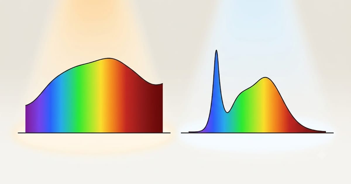
R9 is the score for saturated deep red, and it is not included in the CRI figure printed on the box.
That one sentence explains why two bulbs both marked CRI 80 can make a room look completely different, and why the gap between CRI 80 and CRI 90 feels far larger than ten points.
How CRI is actually calculated
The colour rendering index tests a light source against a set of standardised colour samples, each with its own R number. The headline figure — Ra — is the average of the first eight.
Those eight are all desaturated pastels: muted pinks, greyish greens, soft blues. They were chosen decades ago as representative of everyday surfaces, and they are easy for a light source to render acceptably.
R9 through R15 are the saturated and specific colours: strong red, strong yellow, strong green, strong blue, and skin tone. None of them counts toward the printed number.
Why deep red is the one that fails
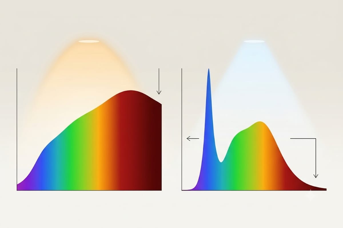
A white LED is normally a blue LED with a phosphor coating that converts part of that blue into longer wavelengths. The result is a spectrum with a hard blue spike and a broad hump across the middle.
The deep red end is the hardest and most expensive part to fill, and it is also the part the eight standard test colours barely probe. So it is the natural place for a manufacturer to economise — the saving is real and the headline number barely moves.
A bulb can therefore reach CRI 80 while emitting almost nothing in the deep reds. An object that reflects only deep red has nothing to reflect, and appears brown or grey regardless of how bright the room is.
What has deep red in it
Far more than people expect:
- Skin. Blood under the surface is why faces go sallow at low R9.
- Cooked meat. Steak, bacon, tomato sauce — all collapse toward brown.
- Wood and brick. Oak, mahogany, terracotta, exposed brick.
- Red wine, fruit, flowers, leather, rugs, most warm-toned textiles.
That list is a large fraction of what a living room and a kitchen contain, which is why R9 has an outsized effect on whether a room feels good.
| R9 | Verdict | Effect |
|---|---|---|
| 0–20 | Poor — common at CRI 80 | Skin sallow, reds go brown |
| 20–50 | Marginal | Noticeable on wood and food |
| 50–80 | Good — typical of CRI 90 | Reds honest, skin natural |
| 80+ | Excellent | Vanity, dressing, art |
What to look for
R9 above 50 for any room you live in. Above 80 for a bathroom vanity, a dressing area or anywhere art hangs.
The practical problem is that most retail listings do not print it. Two rules deal with that:
A manufacturer who publishes R9 usually has a good one. It is a selling point; nobody advertises a weakness.
Silence means assume the worst. A product that quotes CRI 80 and nothing else is very likely in the 0–20 band.
Products aimed at photography, video, retail display and horticulture almost always publish full R-values, because their buyers check. Those are often the same LEDs sold at higher margin into the domestic market without the numbers attached.
The trade-off
Filling in the deep red costs efficiency. A high-R9 bulb typically gives up 5–15% of its lumens per watt compared with a CRI 80 equivalent of the same colour temperature.
On a 9 W bulb running four hours a day, that difference is roughly one watt — a cost so small against the visible improvement that it is not worth thinking about in a living space. In a loft or a garage, take the efficiency instead: the recommendation by room is in what CRI you need at home, and what the two common grades look like side by side is in CRI 90 vs 80.
The full set: R1 to R15
R9 is one of fifteen test colours, and knowing what the other fourteen are makes it obvious why the headline average hides so much.
| Sample | In the printed Ra? | |
|---|---|---|
| R1–R8 | Eight muted pastels — greyish pink, greyish yellow, soft green, pale blue and similar | Yes |
| R9 | Saturated deep red | No |
| R10 | Saturated yellow | No |
| R11 | Saturated green | No |
| R12 | Saturated blue | No |
| R13 | Light skin tone | No |
| R14 | Leaf green | No |
| R15 | A second skin tone | No |
Every colour a room is actually made of sits in the excluded half. R13 and R15 are literally skin, R14 is every houseplant, R10 and R11 are most upholstery and paintwork. The eight that count are the eight nothing in your house is.
R9 gets singled out because it is both the hardest to achieve and the one that drags the others with it — a spectrum with enough deep red usually has enough saturated yellow and enough skin-tone accuracy too. It works as a single proxy for the whole excluded set, which is why it is the one to ask for.
Where the red actually comes from
In a bulb that scores well, the deep red is added by a second phosphor sitting alongside the main yellow one. Two families are used and they behave differently.
Broadband red nitride phosphors emit across a wide band. They fill the gap smoothly, and they waste some output past 700 nm where the eye barely responds — which is where most of the efficiency penalty of a high-CRI bulb comes from.
Narrow-band red, most commonly the fluoride phosphor known as PFS or KSF, emits in a tight spike almost exactly where the eye is still sensitive. It gives high R9 with much less efficiency loss, and it is why recent high-CRI bulbs have closed most of the gap.
It has one quirk worth knowing. That phosphor's emission decays slowly — milliseconds rather than microseconds — so it keeps glowing red briefly after the blue LED behind it switches off. On a rapidly pulsed source you can occasionally see faint red trailing behind moving objects. Harmless in a house, and a real problem in stage and video lighting.
Testing R9 at home, without a meter
You cannot measure it, but you can compare, and comparison is enough to reject a bad bulb.
Take three objects: something deep red (a tomato, a ripe apple, a wine label), a piece of medium-toned wood, and the back of your own hand.
Light them with the candidate bulb and with daylight from a window, at similar brightness, and switch between the two. Under a low-R9 source the tomato reads brown-orange rather than red, the wood loses its warmth and turns grey-brown, and the back of your hand loses the pink under the skin.
Do it with two bulbs side by side and it is unmissable. Do it with one bulb alone and you will convince yourself it is fine, because vision adapts within seconds. Comparison is the whole test — never judge a bulb on its own.
CRI is being replaced
The colour rendering index dates from 1965 and its weaknesses have been known for most of that time: eight pastel samples, a single average, and no measure of whether colours are being over-saturated rather than rendered faithfully.
The replacement is TM-30, which uses 99 samples spread evenly across colour space and reports two numbers rather than one.
Rf — fidelity — is the direct successor to Ra: how close colours land to their appearance under the reference source, on a 0–100 scale.
Rg — gamut — says whether the source saturates or mutes colour on average. Rg of 100 is neutral, above 100 means colours look more vivid than the reference, below means duller.
The pair separates two things Ra conflates. A source can render faithfully while flattening everything slightly, and a source can look punchy and appealing while being technically inaccurate. Retail lighting is often deliberately specified with Rg above 100 for exactly that reason.
TM-30 figures appear on professional datasheets and have not reached domestic packaging. Where you see them, Rf above 85 with Rg between 95 and 110 is a good general-purpose combination.