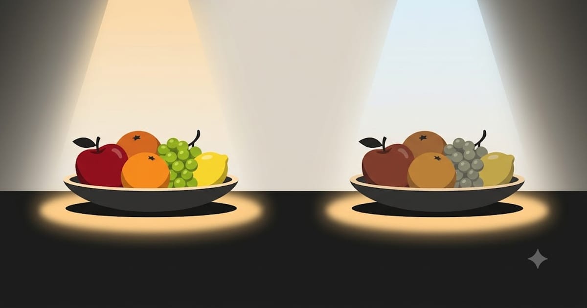
CRI 90 or above anywhere you look at food, faces or fabric. CRI 80 is acceptable in a garage, a loft or a cupboard.
That is the whole recommendation. What follows is why it matters more than the specifications people actually check.
CRI is not colour temperature
These get confused constantly, and they are unrelated properties.
Colour temperature is what colour the light is — warm, neutral or cool.
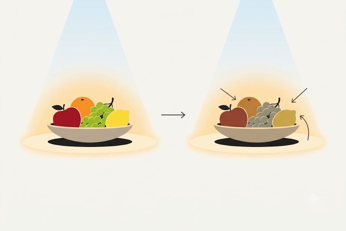
CRI is how honestly that light shows the colour of things it lands on, measured against a reference source, on a scale ending at 100.
Two bulbs can be identical 2700K and completely different at rendering a room. One shows a red sofa as red; the other shows it as brownish. Neither bulb looks different when you point it at a white wall — the difference only appears on coloured surfaces, which is most of a home.
Where each level belongs
| CRI | Verdict | Where |
|---|---|---|
| 70–79 | Poor | Nowhere in a house |
| 80–89 | Adequate | Garage, loft, cupboard, outdoors |
| 90–94 | Good | Living rooms, bedrooms, hallways, kitchens |
| 95+ | Excellent | Vanity, dressing area, art, anywhere colour is judged |
The jump from 80 to 90 is visible in a way the jump from 90 to 95 mostly is not. If you are choosing where to spend, get everything to 90 before taking anything to 95.
The number hides the part that matters
CRI as normally quoted — Ra — is the average of just eight test colours, and all eight are muted pastels. None of them is a saturated red.
Saturated deep red is measured separately as R9, and it is not included in the headline figure. This is why a bulb can advertise CRI 80 while scoring close to zero on R9.
R9 is not an obscure detail. It is skin tone, cooked meat, red wine, wood, brick, terracotta — a large fraction of what a home contains. A room lit at CRI 80 with R9 near zero is exactly the room people describe as feeling "flat" or "cheap" without being able to say why.
Look for R9 above 50. Manufacturers who publish it are usually the ones who score well; a product that quotes CRI and stays silent about R9 is almost always hiding a low number. More on this in R9 explained.
Why cheap LEDs score badly
A white LED is usually a blue LED with a phosphor coating that converts some of that blue into other wavelengths. The quality of the phosphor decides the shape of the resulting spectrum.
Cheap phosphors leave gaps — most often in the deep reds and the cyans. Light with a gap in the red simply has no red to reflect off a red object, so the object cannot look red no matter how bright the room is.
Better phosphors fill the spectrum more evenly, cost slightly more, and produce slightly fewer lumens per watt. That last point is why CRI 90 bulbs are often marginally less efficient than CRI 80 ones — the trade is real, and it is worth making.
Where it matters most
Kitchen and dining. You are judging whether food is cooked and whether it looks worth eating. R9 does most of the work here.
Bathroom vanity. Makeup applied under low-CRI light is applied to compensate for the light, and then looks wrong in daylight. See vanity lighting.
Anywhere you get dressed. Low CRI collapses navy into black and charcoal into brown.
Anywhere with art, wood or textiles. These are chosen for colour. Low CRI is the difference between a room that looks designed and one that looks tired.
What to look for when buying
Check for CRI 90+ and R9 above 50 together. If only one number is printed, assume the missing one is bad.
While you are reading the box, check SDCM or MacAdam step as well — 3-step or lower means bulbs from different boxes will match each other. That is a different specification but the same underlying point: bulbs sold on price alone are cutting the things that are not printed on the front.
The practical difference between the two common grades is set out in CRI 90 vs 80, and the colour temperature decision is separate again — start at the colour temperature chart.
Mixing grades inside one room
Rooms are rarely lit by one bulb, and a mixed room behaves worse than its average suggests.
Put CRI 90 downlights in a living room and leave a CRI 80 bulb in the corner lamp, and the corner does not simply look slightly worse. The eye adapts to the dominant source, so the odd one out reads as wrong rather than as lower-quality — usually as a dull, slightly muddy patch that people describe as a shadow or a dead spot.
The effect is strongest where the two sources overlap on the same surface, and it is worst on skin. Someone sitting between a high-CRI ceiling light and a low-CRI table lamp has one side of their face rendered honestly and the other side sallow.
The rule that follows is simple and it saves money: match within a room before you upgrade across the house. A room fully lit at CRI 80 looks consistent and acceptable. A room half-upgraded looks broken.
What dimming does to colour rendering
Dimming changes more than brightness, and how it changes depends on how the bulb is built.
Most LED bulbs hold their colour temperature as they dim. Reduce a 2700K bulb to 10% and it is still 2700K — dimmer, and the same colour. This is technically correct and feels slightly wrong, because every light humans evolved with went warmer as it went down: a fire, a candle, a filament bulb dropping toward 2200K at the bottom of the dial.
Warm-dim bulbs deliberately reproduce that behaviour, moving from around 2700K at full to 1800–2200K at the bottom. In a living room at night it is the single most effective thing you can buy after CRI itself.
Colour rendering usually survives dimming intact, with one exception worth knowing: some warm-dim bulbs achieve the shift by fading between two LED strings of different colour temperature, and the mixture at intermediate settings can have a spectral dip that shows up as reduced R9 halfway down the dial. If a warm-dim bulb looks good at full and at minimum but slightly odd in between, that is why.
Reading a specification sheet
Six fields, and what each is really telling you.
| Field | What good looks like | What it means |
|---|---|---|
| CRI / Ra | 90+ | Average across eight pastel samples only |
| R9 | 50+ | Deep red — skin, wood, food, wine |
| CCT | 2700K–3000K domestic | The colour of the light itself |
| Duv | within ±0.003 | How far off true white — positive green, negative pink |
| SDCM / MacAdam | 3-step or lower | Whether two bulbs from different boxes will match |
| Flicker % | under 5% | Modulation depth |
A datasheet with all six is a product competing on quality. A box with CCT and lumens only is a product competing on price, and the five missing fields are where that price came from.
The most useful habit is to treat silence as a bad number. Nobody omits a figure that flatters them.
Where to spend first
If the whole house is on cheap bulbs, upgrading everything at once is expensive and unnecessary. This is the order that buys the most visible improvement per pound.
1. Kitchen worktop and dining table. Food, and the most hours of close attention in the house.
2. Bathroom vanity. Faces, at close range, in a mirror — and the room where low CRI produces decisions you carry out into daylight. See vanity lighting.
3. Living room, all of it together. Long evenings, and the room where the mixed-grade problem above does the most damage.
4. Wherever you get dressed. Navy versus black is a daily, practical test that low CRI fails.
5. Everything else in the house.
Never. Garage, loft, cupboard, plant room, outdoor security. Take the efficiency and spend the difference on the first four.