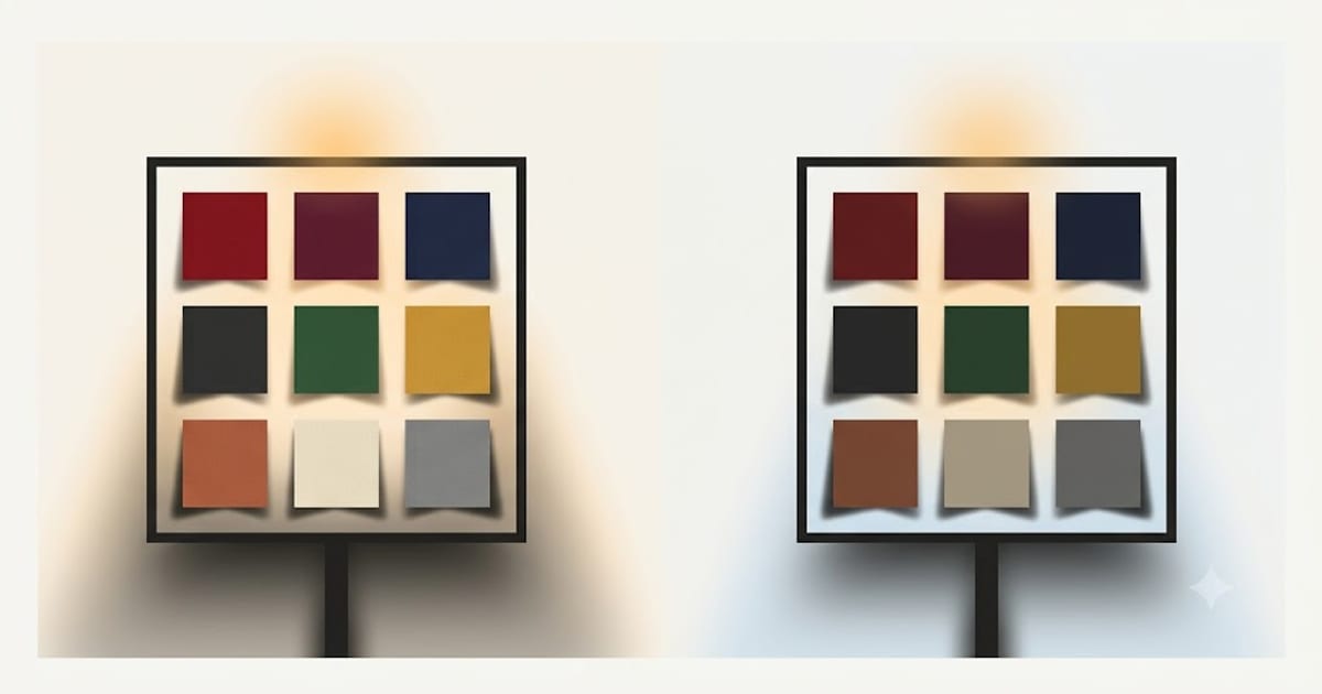
Ten points on a scale that runs to 100 sounds like a rounding error. In a room it is the most visible specification on the box.
What you actually see
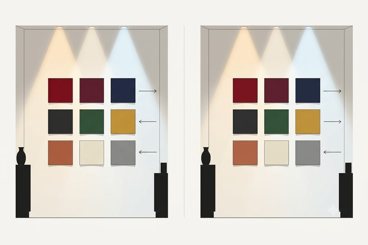
Point a CRI 80 bulb and a CRI 90 bulb at a white wall and they look identical. The difference lives entirely on coloured surfaces, and it shows up in three ways:
Saturated colours lose depth. Deep reds go brownish, rich greens go grey-green. Anything vivid reads as a washed-out version of itself.
Similar colours converge. Navy and black become the same. Charcoal and dark brown become the same. Burgundy and deep red become the same. You lose the ability to tell adjacent shades apart, which is why matching clothes under CRI 80 goes wrong.
Skin looks slightly unwell. Human skin depends heavily on deep red content. Take that away and faces go sallow. Most people notice this without diagnosing it — they describe the room as unflattering.
The number is not what you think it is
CRI as printed — properly called Ra — is the average score across eight test colours, and all eight are muted pastels. Not one of them is a saturated red.
So a bulb can score 80 on the printed figure while rendering deep red catastrophically badly. That colour is tested separately as R9, and R9 is excluded from the headline average.
This is not a technicality. R9 is skin, cooked meat, wood, brick, red wine, terracotta — a very large share of what a home is made of. A CRI 80 bulb commonly scores R9 somewhere between 0 and 20. A CRI 90 bulb typically lands between 50 and 90.
Most of the visible difference between 80 and 90 is actually the R9 difference, which is why the ten points feel like much more than ten points. Details in R9 explained.
| CRI 80 | CRI 90 | |
|---|---|---|
| R9 (deep red), typical | 0–20 | 50–90 |
| Skin tone | Sallow | Natural |
| Navy vs black | Merged | Distinct |
| Wood and brick | Flat | Warm |
| Efficiency | Slightly higher | Roughly 5–15% lower |
| Cost | Baseline | Modestly more |
What it costs
Two things, both small.
Efficiency. Achieving a fuller spectrum means the phosphor converts more of the blue LED output into wavelengths the eye is less sensitive to. A CRI 90 bulb typically produces around 5–15% fewer lumens per watt. On a 9 W bulb that is around one watt.
Price. Better phosphors cost more, though at retail the gap is usually a fraction of what the bulb costs to run over its life.
Neither is a reason to buy CRI 80 for a room you sit in.
Where 80 is genuinely fine
Garage, loft, cupboard, plant room, outdoor security. You are looking for objects, not judging them. Nobody has ever been let down by the colour rendering of a loft light.
Anywhere behind a heavy diffuser at very low output, where nothing is being inspected.
Everywhere else in a house — living room, kitchen, bedroom, bathroom, hallway, dining room — is a room where you look at food, faces or fabric.
How to buy without being caught
Look for CRI 90+ and R9 published together. A manufacturer that quotes CRI but stays silent on R9 is almost always hiding a low number, because a good R9 is a selling point.
Also check SDCM or MacAdam steps — 3-step or lower means two bulbs from different boxes will match each other. Bulbs that publish neither CRI detail nor SDCM are competing purely on price, and both figures are where that price came from.
Colour rendering is separate from colour temperature. Get both right: the temperature decision is in the colour temperature chart, and the full CRI recommendation by room is in what CRI you need at home.
Why 80 is the number you keep meeting
CRI 80 is not a market accident. It is a regulatory floor that became the default because it was the cheapest way to comply.
European ecodesign rules for lamps set a minimum colour rendering index of 80 for general domestic lighting. Manufacturers therefore design to 80, because anything less cannot be sold and anything more costs money most buyers do not know to look for.
The result is a market where 80 is the overwhelming default, 90 is a premium tier with a modest price gap, and the numbers in between barely exist. That also explains why the ten points feel like such a large step: you are not moving along a smooth scale, you are moving between two product tiers built with different phosphors.
The number itself is inherited from the fluorescent era, when the choice was between a cheap halophosphate tube in the 50s and 60s and a triphosphor tube in the low 80s. Eighty meant "the good one" then. With LEDs it means the floor.
Comparing two bulbs fairly
Almost every side-by-side comparison run at home is unfair, and the unfairness usually flatters the wrong bulb. Four things have to match.
Same colour temperature. A 2700K bulb next to a 4000K bulb tells you nothing about CRI, because the colour difference swamps the rendering difference. Compare 2700K with 2700K.
Similar brightness. The brighter of two sources looks better regardless of its spectrum. Match the lumens, not the watts — a CRI 90 bulb of the same wattage will be slightly dimmer.
Same position and distance. Move one bulb closer and it wins.
Something coloured to look at. A white wall shows nothing. Use fruit, wood, fabric in several similar dark shades, and a hand.
The honest test is two identical lamps a metre apart, switched alternately while you look at the same objects. Switch rather than compare simultaneously — the eye adapts to whichever it looks at, and side-by-side viewing across a room lets it adapt to both at once.
What Ra does not measure at all
Two bulbs can both be CRI 90 and still not look the same, because Ra is silent on three properties.
Saturation. Ra measures how close colours land to the reference, not whether they land consistently short or consistently over. A bulb that mutes everything slightly and one that lifts everything slightly can score the same.
Whiteness and tint. Two bulbs at the same nominal 3000K can sit on opposite sides of the blackbody line — one faintly pink, one faintly green. This is measured as Duv, and a bulb above about +0.006 reads as sickly and greenish regardless of its CRI.
Consistency between units. Two bulbs from the same box can differ visibly. That is SDCM, quoted in MacAdam steps: 3-step or lower and nobody will see the difference in a row of downlights; 5-step or unstated and one of six will stand out.
The practical version: CRI 90, R9 above 50, Duv near zero, SDCM 3 or better. A product publishing all four is telling you it has nothing to hide, and that is more informative than any single number on the list.
The one place the ten points genuinely do not pay
There is a real exception to "buy 90 everywhere you live".
Very high-output fittings in tall spaces — a stairwell, a double-height hall, a garage bay — are sized on lumens per watt, and the 5–15% efficiency penalty turns into real fitting count and real heat. In those spaces nobody is judging fabric or food, and 80 is the correct engineering answer rather than a compromise.
Everywhere at eye level, in a room with people in it, the ten points buy more visible improvement per pound than any other lighting decision available.