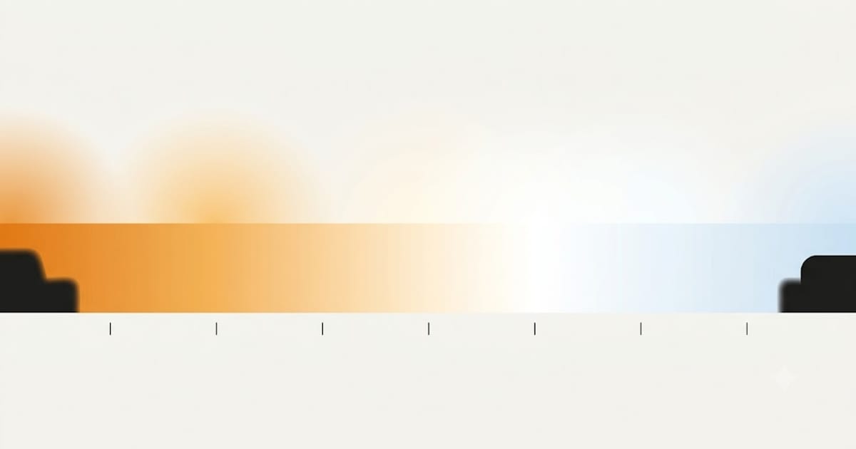
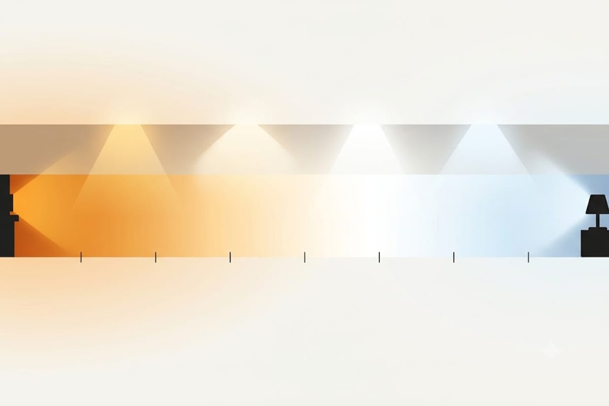
Colour temperature is measured in kelvin, and the scale runs opposite to intuition: low numbers are warm, high numbers are cool. It comes from heating a theoretical object until it glows — at low temperatures it glows red, at high temperatures blue — which is physically sound and experientially backwards.
The full chart
| Kelvin | Appearance | Natural equivalent | Where it belongs |
|---|---|---|---|
| 1800K | Deep orange | Candle flame | Decorative filament bulbs only |
| 2200K | Amber | Sunset, gas lamp | Accent, restaurant, outdoor |
| 2700K | Warm white | Incandescent bulb | Living room, bedroom, dining |
| 3000K | Warm white, cleaner | Halogen | Kitchen, bathroom, hall, stairs |
| 3500K | Neutral | — | Mixed-use rooms, offices |
| 4000K | Cool white | — | Kitchen with cool finishes, closet |
| 5000K | Daylight | Midday sun | Garage, workshop, laundry |
| 6500K | Cool daylight | Overcast sky | Industrial, horticultural |
The useful range is narrower than the chart
Almost every domestic decision lands between 2700K and 4000K. Everything below 2700K is decorative rather than functional — a 2200K bulb is beautiful and will not light a room. Everything above 5000K sacrifices colour rendering for a blue-white that no domestic space needs.
That leaves four values that matter, and the choice between them is usually settled by two questions:
Is this a room for being in, or for doing something in? Being in takes 2700K. Doing takes 3000–4000K.
What colour are the surfaces? Warm finishes — wood, cream, brass — want 2700–3000K. Cool finishes — white, grey, steel — want 3500–4000K. The full reasoning is in 3000K or 4000K in a kitchen.
Brightness and colour are not independent
The Kruithof effect describes a relationship most people notice without naming: warm light looks natural at low light levels, cool light looks natural at high ones.
A candle at 1800K is pleasant. A ceiling flooded with 1800K would look like a fault. A workshop at 5000K and 50 foot-candles feels clean and correct; a bedroom at 5000K and 5 foot-candles feels like a waiting room at night.
The practical consequence: as you dim a room, its light should get warmer, not just dimmer. Incandescent bulbs did this automatically because the filament genuinely cooled. Most LEDs do not, which is why a dimmed LED can feel grey. Bulbs that do are sold as warm dim or dim to warm, and they are the closest thing to a straight incandescent replacement.
Two specifications that matter more than kelvin
CRI (colour rendering index) measures how honestly a light shows colour, and it is completely independent of colour temperature. A 2700K bulb at CRI 95 and a 2700K bulb at CRI 80 are the same colour and show your room very differently. Look for CRI 90+ anywhere you look at food, faces or fabric. See CRI 90 vs 80.
SDCM (MacAdam steps) measures how tightly the manufacturer holds the colour point. Two bulbs both labelled 3000K can be visibly different from each other. 3-step or lower means bulbs from different boxes will match. Unspecified means they may not — which is where the one pink-looking downlight in a row of six comes from.
The rule that breaks rooms
Do not mix colour temperatures within one sightline. Your eye adapts beautifully to one white point and badly to two. Given a mixture, it locks onto one and renders the other as tinted, so one perfectly good fitting looks broken.
An open-plan kitchen-diner is a single sightline even though it is two rooms. A closet with a door is not, which is why a 4000K closet inside a 2700K bedroom is fine.
The intentional exception is task lighting whose source you never see — an under-cabinet strip or a desk lamp can run cooler than the room around it, because you look at the worktop rather than the fitting.
Getting the quantity right
Colour temperature decides how a room feels. Quantity decides whether you can see. The method is in lumens per square foot by room, and the figure for a specific room comes out of the room lighting calculator — pick your room type and dimensions and it works out the total, the bulb count and the recommended kelvin together.
Real light sits off the line, and that is what tint is
The chart above treats colour temperature as a single number on a single line. The line is real — it is the path a heated black body traces as it glows from red through white to blue — but manufactured light does not have to sit exactly on it.
A source slightly above the line reads as greenish. Slightly below, as pinkish. Both can be labelled the same kelvin figure, because the kelvin figure is only the nearest point on the line.
The measure of that offset is Duv. Zero is on the line. Positive is toward green, negative toward pink.
| Duv | Appearance |
|---|---|
| +0.006 and above | Visibly green — the fluorescent-office look |
| +0.003 | Slightly cool and clinical |
| 0.000 | Neutral, on the black body line |
| −0.003 | Very slightly pink, often preferred in warm rooms |
| −0.006 and below | Visibly pink |
This is why two bulbs both marked 3000K can look different in a way that "warmer" and "cooler" does not describe. One is green, one is pink, and they are the same colour temperature.
Good manufacturers hold Duv within about ±0.003 and publish it. Where it is not published, a slightly pink cast is generally preferred to a green one in a domestic room, and a strongly green bulb is the single most common reason someone dislikes a light they cannot otherwise fault.
How an LED produces a given colour temperature
Understanding the mechanism explains most of the trade-offs elsewhere.
Almost every white LED is a blue LED with a phosphor coating over it. The blue chip emits at around 450 nm. The phosphor absorbs part of that blue and re-emits it across longer wavelengths — yellow, orange, red.
The colour temperature is set by how much phosphor is applied. A thin coating lets more blue through, giving a cool white. A thick coating converts more of it, giving a warm white.
Three consequences follow directly.
Warm white is slightly less efficient. More conversion means more energy lost as heat in the phosphor, which is why a 2700K bulb typically produces a few per cent fewer lumens per watt than a 4000K one of the same family.
All of them have a blue spike. The chip's own emission shows as a peak at 450 nm in every phosphor-converted LED, warm or cool. It is smaller relative to the rest in a warm bulb, which is why warm light is the better evening choice — but no phosphor LED is genuinely free of it.
Colour rendering is a phosphor question, not a temperature question. How evenly the phosphor fills the spectrum decides CRI, and it is entirely independent of how thick the coating is. That is why 2700K bulbs at CRI 80 and at CRI 95 both exist — see CRI 90 vs 80.
Outdoors, the number means something different
Domestic reasoning stops at the back door. Outdoor lighting is judged on three things that do not apply indoors at all.
Neighbours and the sky. Blue-rich light scatters far more in the atmosphere than warm light does, which is why a 5000K floodlight produces a visible glow over a whole garden and a 2700K one does not. Dark-sky guidance generally puts the limit at 3000K or warmer for domestic outdoor fittings, and 2200K amber where it can be tolerated.
Insects. Attraction to artificial light is strongly wavelength-dependent and falls sharply as the light gets warmer. An amber 2200K fitting near a door or a seating area attracts a small fraction of what a 4000K one does. This is the practical argument that persuades people the sky argument does not.
Wildlife. Blue-rich light at night disrupts nocturnal animals more than warm light, and the effect extends well beyond the lit area.
| Outdoor use | Kelvin |
|---|---|
| Patio, seating, near doors and windows | 2200–2700K |
| Path and step lighting | 2700K |
| General garden and facade | 2700–3000K |
| Security floodlight | 3000K, on a motion sensor |
| Anything above 3000K | Hard to justify domestically |
The instinct to fit a bright cool floodlight for security is worth resisting for a fourth reason as well: a high-output cool source produces deep shadows and glare that make it harder to see an intruder, not easier. A lower-output warm fitting on a motion sensor works better on every count.