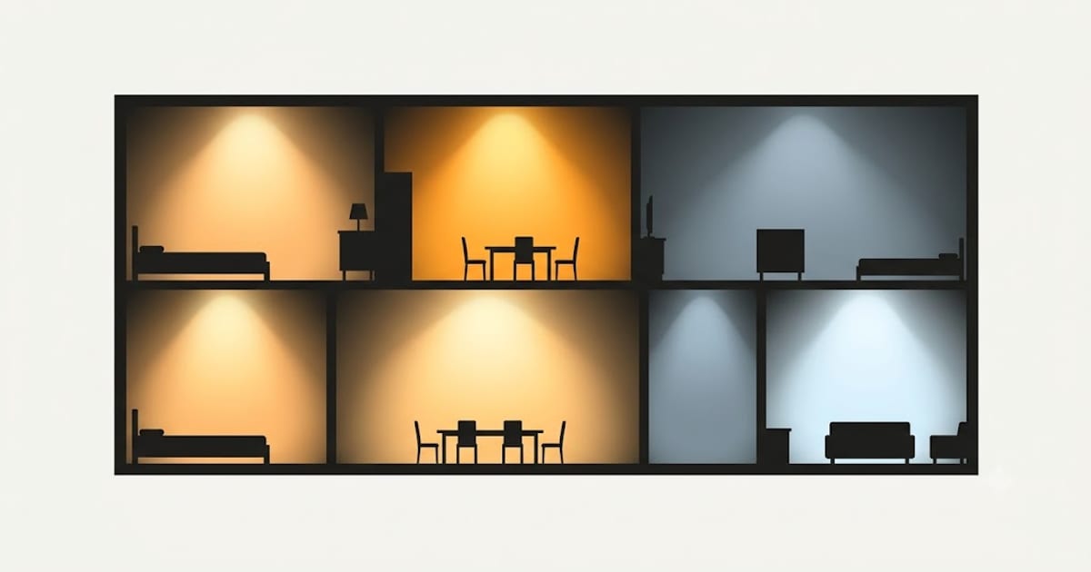
Lumens per square foot is the useful form of a lighting target, because it is the one you can multiply by a room you have measured. Here is the whole house in one place.
The reasoning, and the reason a total on its own is not enough, is in how many lumens a room needs.
The table
| Room | Footcandles | Lumens per sq ft |
|---|---|---|
| Hallway, stairs, closets | 5–10 | 5–10 |
| Bedroom | 10–20 | 10–20 |
| Living room | 10–20 | 10–20 |
| Dining room | 20–30 | 20–30 |
| Bathroom, general | 20–30 | 20–30 |
| Laundry | 30–40 | 30–40 |
| Kitchen, general | 30–40 | 30–40 |
| Home office | 30–50 | 30–50 |
| Bathroom vanity | 50–80 | 50–80 |
| Kitchen worktop | 50–100 | 50–100 |
| Garage, workshop | 50–75 | 50–75 |
For rough residential sizing, lumens per square foot and footcandles are numerically the same, which is why the two columns match. That equivalence assumes the light reaches the surface, which is the whole subject of the corrections below.
The footcandle bands come from illuminance recommendations published by lighting bodies such as the IES, reduced to the ranges that matter at home.
Apply the corrections, not just the number
Ceiling height. The table assumes a standard 8-foot ceiling. Light spreads and weakens over distance:
| Ceiling | Multiply by |
|---|---|
| 8 ft | 1.00 |
| 9 ft | 1.10 |
| 10 ft | 1.20 |
| 12 ft | 1.40 |
Surface colour. Pale rooms recycle light; dark ones absorb it:
| Room finish | Multiply by |
|---|---|
| White walls, pale floor | 0.85 |
| Mid-tone | 1.00 |
| Dark walls, dark floor | 1.30 |
Those stack. A dark room with a 10-foot ceiling is 1.20 × 1.30 = 1.56× the table figure, for the same result as a mid-tone room at standard height.
Task areas are a separate calculation
Notice that the table has two rows for kitchens and two for bathrooms. The high figure is not for the whole room — it is for the small area where a specific task happens.
Calculate them separately:
- General kitchen lighting covers the whole floor area at 30–40 lm/sq ft.
- Worktop lighting covers only the worktop, which is typically 15–25 % of the room's floor area, at 50–100 lm/sq ft.
A 150 sq ft kitchen therefore wants roughly 4,500–6,000 lumens of general light, plus roughly 1,500–3,000 lumens aimed at about 30 sq ft of worktop.
Trying to reach worktop levels by making the ceiling light brighter does not work. You stand between the ceiling and the counter, so your own shadow lands exactly where you are working — and everything else in the room becomes uncomfortably bright.
Where the total goes
The number is how much light to buy. It says nothing about distribution, and distribution decides whether the room works.
As a working rule: more sources at lower output beats fewer at higher output, in every room except a workshop. Five 800-lumen sources produce a room; one 4,000-lumen source produces a hotspot and four dark corners.
The exception is genuinely task-driven space — a garage or workshop wants even, high, shadow-free illumination and is one of the few places where a small number of large fittings is the right answer.
Sanity check against fittings you can buy
Translating the table into real products, for common rooms:
| Room | Area | Target | Roughly |
|---|---|---|---|
| Bedroom | 140 sq ft | 1,400–2,800 lm | ceiling fitting + two bedside |
| Living room | 220 sq ft | 2,200–4,400 lm | ceiling + two table + one floor |
| Kitchen | 150 sq ft | 4,500–6,000 lm general | six recessed + under-cabinet |
| Bathroom | 60 sq ft | 1,200–1,800 lm general | ceiling + vanity fitting |
| Home office | 120 sq ft | 3,600–6,000 lm | ceiling + a proper desk lamp |
If your total looks far off these, check the corrections before assuming the table is wrong.
What this page does not cover
- Colour temperature — the same lumens at 2700 K and 4000 K produce very different rooms.
- Colour rendering — two lamps at identical lumens and kelvin can render skin and fabric quite differently.
- Daylight. Every figure here is for after dark.
- Precise design calculations use the coefficient of utilisation for the specific fitting and a light loss factor. The simplification here is right for choosing lamps and wrong for specifying a commercial installation.
Multiply by your floor area, apply the two corrections, then spread it across several sources.
The table describes a new installation
Every figure above assumes clean fittings and new lamps. Real installations deliver less than that within a couple of years, and lighting designers account for it with a light loss factor — a multiplier applied at the design stage so the installation still meets its target at the end of its maintenance cycle rather than only on the first day.
Three components, all of them working in the same direction.
Lamp lumen depreciation. Output falls with age. An LED at its L70 point is delivering 70% of what it started with, and it has been below 100% for the entire journey there. Over a typical domestic life, assume roughly 0.90.
Luminaire dirt depreciation. Dust on a diffuser, and dust on the lamp inside it. A recessed downlight in a kitchen loses noticeably more than a sealed fitting in a bedroom. Between 0.85 and 0.95 depending on the room.
Room surface depreciation. Walls and ceilings darken with age, smoke and cooking. Around 0.95 in a normal room over several years.
Multiplied together, a realistic domestic light loss factor is around 0.80–0.85. In other words, an installation designed exactly to the table will be about 15–20% short of it a few years in.
Two responses, and both are reasonable. Design to the upper end of each band rather than the lower. Or accept the table as-is and fit dimmers, so the installation starts at 80% and has headroom to be turned up later. The second is cheaper and more flexible, and it is what most people should do.
Measuring what you already have
Before adding light, it is worth knowing what is there. A phone will do it well enough to make decisions.
Use a lux meter app. Most phones have an ambient light sensor and free apps read it. They are not laboratory instruments — expect ±20–30% — but that is easily good enough to tell 80 lux from 300 lux.
Convert correctly. Apps usually report lux, and the table above is in footcandles. 1 footcandle = 10.76 lux, so divide lux by about 10.8. A kitchen worktop target of 50–100 footcandles is 540–1,080 lux.
Measure at the working plane, not at the ceiling. Lay the phone face up on the surface you care about — the worktop, the desk, the floor for a general reading — with the sensor uncovered. Phone sensors are usually near the top of the screen bezel.
Take several readings and note where they were. The useful output is a small map: 600 lux at one end of the counter, 180 in the corner, 90 in front of the fridge. That tells you where to add light, which a single average never does.
Do it after dark, with the same lights you would normally have on.
| Reading at the worktop | Verdict |
|---|---|
| Under 200 lux | Substantially under-lit for food preparation |
| 200–500 lux | Usable, tiring for detailed work |
| 500–1,000 lux | Correct |
| Over 1,500 lux | More than needed; check for glare |
Older eyes need substantially more light
This is the single largest correction in the whole subject and it appears in none of the standard tables.
The lens of the eye yellows and the pupil's maximum aperture shrinks with age. The combined effect is large: a person of 60 needs roughly two to three times the light of a person of 20 to perform the same visual task with the same ease, and by 75 the ratio is larger still.
Alongside the quantity, two qualities matter more with age. Glare tolerance falls sharply, because a yellowed lens scatters more light inside the eye — so the answer is never one very bright source. And contrast sensitivity declines, which makes edges, steps and thresholds harder to judge.
The practical version, for a home occupied by someone older:
- Take the top of each band in the table, then apply a further multiplier of 1.5–2 for close tasks such as reading, cooking and stairs
- Deliver it from more sources, never from fewer and brighter
- Put real light on stairs, thresholds and the edges of steps, which is a safety matter rather than a comfort one
- Use CRI 90+, because failing contrast sensitivity is partly compensated by honest colour
Actual reflectance values
The surface-colour correction in the table is a simplification of a real quantity. These are the figures behind it, and they are worth seeing because the range is wider than people expect.
| Surface | Reflectance |
|---|---|
| Flat white paint | 80–85% |
| Off-white, magnolia, pale grey | 70–75% |
| Mid grey, beige, light wood | 40–50% |
| Mid-tone wood, terracotta, mid blue | 25–35% |
| Dark grey, dark wood, navy | 10–20% |
| Matt black, very dark carpet | 3–5% |
A white ceiling returns most of what reaches it; a dark floor returns almost nothing. That is why the ceiling is the most important surface in the room for perceived brightness even though nobody looks at it, and why painting a dark ceiling white does more than adding a fitting.
It also explains why the correction stacks with ceiling height. A tall room has more wall area, so wall reflectance matters more there, and a tall dark room is the hardest case in domestic lighting.