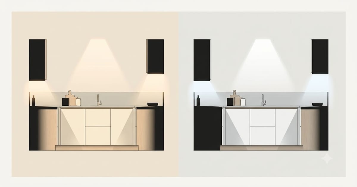
Search this question and you get a confident answer either way. That confidence is misplaced. 3000K and 4000K are both correct choices for a kitchen — the deciding factor is not the room type, it is what the light has to land on.
The scale is backwards, which is why this confuses people
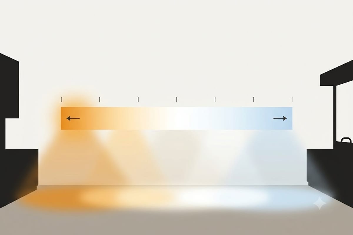
Colour temperature runs in the opposite direction to intuition. Lower numbers are warmer. 2700K is the orange-tinted light of an old incandescent bulb. 6500K is the blue-white of an overcast sky. The physics comes from heating a theoretical black body until it glows, and at those temperatures it glows blue — but nobody experiences light that way.
| Kelvin | Reads as | Where it belongs |
|---|---|---|
| 2700K | Warm, yellow | Living rooms, bedrooms, evening light |
| 3000K | Warm white | Kitchens with wood or cream finishes |
| 3500K | Neutral | Mixed-use kitchens, laundry rooms |
| 4000K | Cool white | Kitchens with grey, white or steel finishes |
| 5000K | Daylight | Garages, workshops, task-only areas |
The actual deciding question: what colour is the kitchen?
Light does not have a colour you perceive directly. You perceive the colour of the surfaces it reflects off, which is why the same bulb transforms one kitchen and ruins another.
Warm finishes — oak, walnut, cream, brass, terracotta, warm-toned stone — go with 3000K. Warm light amplifies what is already there. Put 4000K on warm wood and it goes flat and slightly grey, like a photograph with the saturation pulled down.
Cool finishes — white gloss, grey cabinets, stainless steel, black granite, marble with grey veining — go with 4000K. These surfaces have very little warmth to amplify. Under 3000K, white cabinets go faintly yellow and grey worktops turn muddy brown.
That single test settles it in most kitchens. If yours is genuinely mixed, 3500K exists precisely for this and is under-used.
The second question: is it a kitchen or a room?
The other half of the answer is how the room is used.
A working kitchen — a galley, a utility space, somewhere you cook and leave — benefits from 4000K. Cooler light makes edges crisper and detail easier to resolve, which matters when you are reading a knife edge against a chopping board.
A kitchen-diner or open-plan kitchen is a living space for most of its hours. Sitting at a table under 4000K in the evening feels institutional. The room reads as somewhere you work rather than somewhere you eat.
This is not preference dressed up as fact. The Kruithof effect describes it: at high light levels, cooler light looks natural, while at low light levels the same light looks harsh and unpleasant. A bright kitchen at midday carries 4000K comfortably. The same kitchen dimmed at 9pm does not.
The answer that avoids choosing
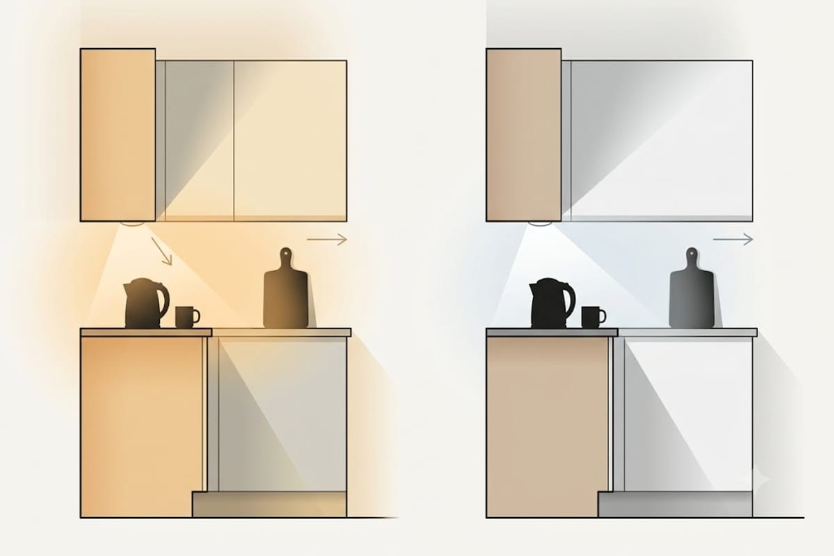
If the kitchen is open-plan, the correct configuration is both — and it is cheaper than most people expect.
- Under-cabinet task lighting at 4000K, aimed at the worktop where detail matters
- Ceiling and pendant lighting at 3000K, which is what the room reads as
Nobody looks directly at an under-cabinet strip, so the cooler light does its job on the worktop without setting the mood of the room. This is the standard arrangement in kitchens designed by people who light rooms for a living, and it is why their kitchens look good in both photographs and real life.
Two rules that matter more than the number
Never mix colour temperatures within one sightline at the same layer. Two ceiling fittings 300K apart looks like one of them has failed. Your eye adapts to a single colour temperature very well and to two very badly.
Check the tolerance, not just the label. Two bulbs both sold as 3000K can be visibly different. The specification to look for is SDCM or MacAdam step — 3-step or lower means bulbs from different boxes will match. Cheap bulbs are often 5-step or unspecified, which is how one downlight ends up looking pink next to its neighbour.
Working out the rest of the kitchen
Colour temperature is the easier half of the problem. The quantity of light is the half that goes wrong more often — and it is arithmetic rather than judgement. The lumens a kitchen needs covers the method, and you can get the figure for your own room from the kitchen lighting calculator.
Once the quantity is right, colour rendering is the specification that decides whether food looks like food — and it matters more in a kitchen than colour temperature does.
The five-minute finish audit
The rule above — warm finishes take 3000K, cool finishes take 4000K — is easy to state and surprisingly easy to get wrong, because people judge a kitchen by its cabinets and the cabinets are often the minority of the visible surface.
Do it properly by listing what actually fills your field of view, with rough areas.
| Surface | Typical share of what you see | Warm or cool |
|---|---|---|
| Wall cabinets and their doors | 20–25% | ? |
| Base cabinet fronts | 15–20% | ? |
| Worktop | 10–15% | ? |
| Splashback | 5–10% | ? |
| Floor | 15–20% | ? |
| Walls and ceiling | 20–30% | ? |
Fill in the right-hand column and count. A kitchen with white gloss cabinets reads as a cool kitchen — until you notice it has an oak floor, a wooden worktop and warm white walls, which together outweigh the doors.
Two surfaces are weighted more heavily than their area suggests. The floor, because it takes the most direct light from a ceiling grid and reflects it back into everything else. And the ceiling, because a warm-tinted white ceiling will tint every bounce in the room regardless of what the bulbs are doing.
When the count lands close to even, take 3500K rather than agonising. It is the value that exists for exactly this case and it is under-stocked rather than unsuitable.
Appliances complicate the choice
Stainless steel is the reason many warm kitchens still feel cool, and it is worth accounting for separately.
A large stainless fridge, a range cooker front and an extractor hood together can be a substantial share of one wall, and stainless is close to a neutral mirror — it reflects the colour temperature of the light rather than imposing one of its own. Under 3000K it reads warm and slightly golden, which most people find pleasant. Under 4000K it reads cold and blue-grey, which reads as commercial.
Black appliances and black glass do the opposite: they reflect almost nothing and shrink the effective lit area, which makes a kitchen with a lot of them feel dimmer than the arithmetic suggests. Add roughly 10% to the total lumens for a kitchen dominated by dark fronts.
How a kitchen looks in photographs is not how it looks
Worth stating, because kitchen decisions are increasingly made from images.
A camera applies automatic white balance, which removes exactly the information you are trying to judge. A photograph of a 4000K kitchen and a photograph of the same kitchen at 3000K, both taken on a phone, will look nearly identical, because the camera has neutralised the difference in each.
Photographs published by kitchen manufacturers are usually lit for the camera rather than by the fittings on show, often at a neutral 4000–5000K with fill lighting from outside the frame. That is why a kitchen ordered from a brochure so often looks warmer and dimmer than expected once installed.
Two ways to judge honestly. Look at a real kitchen at night, which is when the difference exists. Or lock the white balance on your camera before taking comparison photos of two options, so both are recorded against the same reference.
Retrofitting an existing kitchen
If a kitchen is already fitted and the light feels wrong, work through it in this order — cheapest first, and each step is often enough on its own.
1. Check the colour rendering before the colour temperature. A kitchen that feels flat and unappetising is more often a CRI 80 problem than a kelvin problem. Food depends on deep red, which is the value CRI 80 bulbs score worst on. See what a good CRI is.
2. Add under-cabinet lighting before changing anything overhead. Most kitchens that feel dark are not short of general light — they are short of light on the worktop, where the person standing at it casts a shadow. This is the single highest-value change in most kitchens.
3. Then change the ceiling colour temperature, once you know the first two were not the cause.
4. Split the switching last. Overhead and under-cabinet on separate switches, both dimmable, turns one lighting scheme into three usable ones and costs less than replacing fittings.